Design Tricks the Pros Use on DIY Websites
Make your website look like it was designed by a professional with these five tricks of the trade.
Building your own website opens up a whole world of possibilities. Suddenly your website isn’t a black box any more. You can control what it says and how it looks.
But if you’re like a lot of DIY’ers, you might notice a big difference at first between how you want your website to look and, well...how it actually looks. As with many DIY projects or #pinterestfails, it can be hard to match a professional designer right off the bat.
Fortunately there are some tricks of the trade that can take your website to the next level, and make it look just like those sample websites you love. Think of these as the secrets that web designers already know—and that you can now easily apply to your own website.
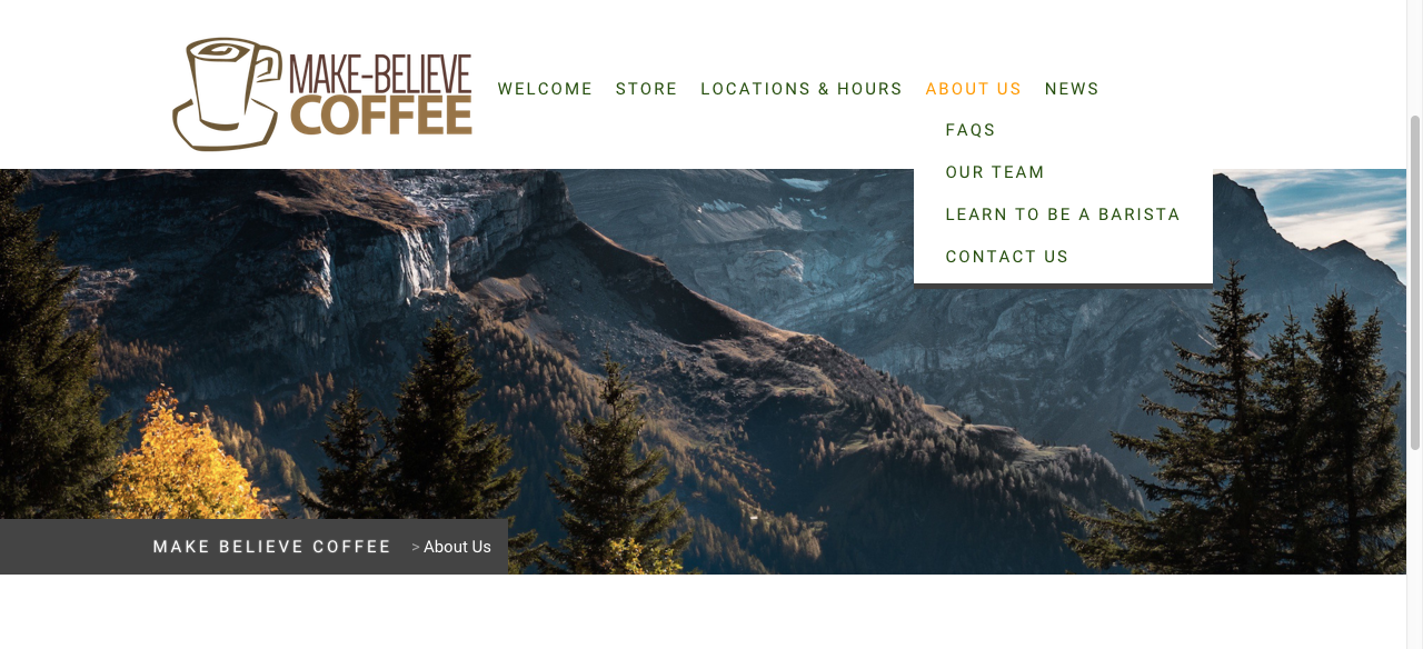
Keep your navigation menu short
The fastest way to make your website look “homemade” is to cram too many pages into your navigation menu. On any professional website, nine times out of ten you’ll see a navigation menu that’s short and sweet. Apple, Gap, LL.Bean, Etsy, and even Amazon all manage to keep their top menus to one line. If they can do it, we all can.
A typical rule of thumb is to put no more than seven choices in your navigation bar, with dropdown menus if you need them. If your menu is running onto multiple lines, that’s a sign you could whittle it down. Your efforts will make it look nicer, but also makes it easier for your visitors to navigate...so it’s a win/win.
 Instead of listing all your pages in one very long navigation menu...
 …try to include just the most important pages and use a drop down menu for subpages
Limit yourself to two fonts
With thousands of free fonts floating around online (and over 800 in Google Fonts alone), your head might be spinning with possibilities. The fact is, you really only need two. Good designers take advantage of creative fonts, to be sure, but they also know how to balance personality and readability. That’s why they usually choose a distinctive font for headings, and one very simple, easy-to-read font for body text. That’s it! Rinse, repeat.
Sans serif fonts are the easiest to read on a screen, so they’re a good choice for paragraphs and navigation menus (Open Sans, Roboto, Lato, and Ubuntu are all popular for good reason). Then you can have some fun using a more decorative font in small doses elsewhere. But be picky. You want the font to be interesting, but you still need people to be able to read it.
 This sample website uses sans serif font Raleway for the navigation menu and body text, and decorative font Sacramento for the headings.
Choose just one or two accent colors
If you thought there were a lot of fonts in this world, just wait ‘til you start on colors. But just as before, restraint is on your side. An experienced designer can create a whole color palette to bring harmony to a design. If you’re just starting out, this approach can leave you with a bit of a mess on your hands.
The good news is you don’t need to get wrapped up in color wheels, tertiary colors, color pickers, or anything else of the sort. Just pick one or two colors you like, and use them consistently throughout your website. A simple approach is to make most of your website black and white, and use your accent/brand colors sparingly to breathe some life into the design.
 Jimdo website Vers Branding uses a simple color scheme of black and white with a pop of red for a big impact.
Meet your new best friend: white space
You started your own website so that you can fill it with your own information—so why would you leave a lot of it empty? Well, designers know that websites with plenty of “white” (think, empty) space are actually easier for people to read and find their way around. The no-clutter approach is inviting, and it helps people prioritize what to look at.
White space also sends a message that a website is more sophisticated and elegant —similar to how a discount clothing store has racks stuffed with clothing, while a high-end boutique will have just a few items on each rack.
You can put this into practice on your own website by leaving some more breathing room around each element—try spacing out your paragraphs out a little more, using only small chunks of text, or adding some space to the top and bottom of each page. As an added bonus, websites with generous white space will also be easier to read on mobile devices (see below).
 Caption: Give your design room to breathe by using enough “white space.”
Always check your website on a mobile device
Most of us will design and build our websites on a computer, so it’s easy to forget that many visitors come to your site via cell phones or tablets instead. This means they’ll see a whole different picture–on a very tiny screen. The easiest thing you can do is simply look at your website every once in awhile from a mobile phone or tablet to make sure it’s all working properly. You’ll look for alignment issues, text that’s too small, or buttons that are too close together to accurately mash with your thumbs, for example. You can also try Google’s free “Mobile-Friendly” Test to diagnose mobile issues on your website. Your on-the-go-visitors will thank you for it.
----
Professional web designers can spend years mastering their craft. But the basics of website design are open to all of us, and many of them actually require you to do less rather than more. Start with these simple design secrets, and you’ll soon have a website that looks just how you imagined—and one that your visitors love, too.
This piece comes from Jimdo , the easiest way to create a website with no coding required. Learn more website and business tips on our blog, 8Days .